Before you is the reason the human race will never colonize another planet.
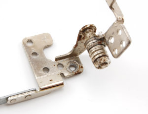
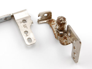
This is a screen hinge from a Sony Vaio laptop. Notice anything disturbing about such a load-bearing part?
It has too many useless holes.
It has a hole that weakens the part right at the point where strength is needed most. This part has already begun to bend under the stress of normal use, and the opposite hinge from the same laptop has already snapped in two at that location.
With design like this, who needs enemies?
Instead of a nice, wide, strong tongue of steel connecting the hinge to the screen, some idiot at Sony decided it would be a good idea to design a hole right across the weakest spot. So now there are two narrow edges tasked with holding everything together, and if they snap, the hinge flaps in the breeze, useless. It’s like drilling a 3-inch hole in a two-by-four and expecting it to be just as strong as before.
A plastic nub pokes through the offending hole to help with alignment when the screen is assembled. There is no reason why outer alignment guides wouldn’t work instead. Doing so would greatly increase the structural integrity of the hinge without hampering assembly in the least.
I guess I’ll just sit here and wait for the asteroid to come and wipe us all out, because we sure aren’t getting off the planet soon with brain-dead design decisions like that.

